
If you like something blue, then you'll certainly have a great choice of products as one of the on-trend colours for 2020 is Classic Blue.
Described as "solid and dependable" and a shade "we can always rely on" by Pantone Color Institute executive director Leatrice Eiseman, Classic Blue will make a strong statement on its own — as a bold feature wall or as an accessory against a neutral backdrop — or layered with other lighter shades of blue, such as denim or sky, for a tonal look.
Bedroom or sitting room
Cold or calming?
Some people feel blue is calming and it's the most recommended bedroom colour because it promotes relaxation and tranquillity.
Others consider blue a cold colour and perhaps best kept for those people living in warm sunny climates, but if you choose wisely you can find a shade that will work even in north-facing rooms.
While it may be considered calming and good for sleep, it may not be good for the appetite as it's sometimes associated with mold!
Could blue add 65% in value to your home?

Living on a colourfully painted street could add thousands to your house price according to the The HomeOwners Alliance who compared valuation figures between bland and colourful streets. The research found that prices could differ between 2 per cent to an amazing 65 percent depending on house colour.
Norwich - One of the biggest price difference was found in Norwich. where an average three-bedroom house on vibrant Ten Bell Lane was worth 65 percent more than one on nearby Victoria Street.
Kitchen blues

Blue is a great choice for kitchens. When lighter shades are used, they can create a crisp, clean look and are recommended for walls, cabinets, or even the ceiling. Bight blues can be quite invigorating so work best when used sparingly; otherwise they can overpower a room.
Light grey can contrast well with blue without overshadowing its position as the central focus of the kitchen. For the brave, a more stark contrast can be blue cabinets with brighter colours such as white, cream or yellow.
Household appliance manufacturers have really embraced colour and white goods are no longer only available in white and there's now a great choice of blue appliances for the kitchen including the AGA which is quite a statement piece and would create a real focal point. Just remember - your appliance is going to be there for some time so make sure you really love that blue before you blow your budget!
If you're not ready to swap your white (or chrome) goods for blue ones, then there's a much more cost effective way of introducing some classic blue to the kitchen by way of some carefully curated accessories.
Trading up your textiles for a new set will add an instant hit of that longed for colour of the year!
Printmaker Kate Guy made her very first linocut when she was about 6, it is of a cat. With a degree in Graphic Design she worked as a designer, illustrator, in an animation studio, as an architectural glass designer and as an Art teacher.
Kate now makes a range of homeware products which feature her illustrated series of Regional Recipes and Simple. Designed using her original linocut prints, each image is an ingredient and cooking instructions are on the packaging. The range is printed and made in the UK from high quality organic cotton.

Being bold with blue
Looking to embrace hues of blue in a big way? Then your walls are an obvious place to start.
The (relatively!) simple option is paint of course - it's easy to apply and can also be changed without too much problem should you decide that particular shade of blue isn't for you - it's always best to try a few test shades first - paint them onto paper or card so you can move them round the room and try them out on different walls to see how the light affects them during different times of the day.
Wallpaper is another option and with that you'll also be adding pattern and/or texture - it's also more of an investment so be sure you really love it before you commit it to your walls as it's going to be a much more costly exercise to replace than if you'd just painted!
You can choose to use wallpaper on all four walls, on a feature wall or two, in alcoves or panelling or even customise a piece of furniture.
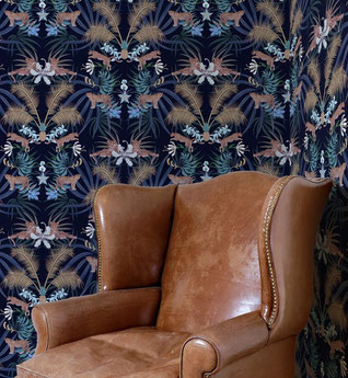
This bold Leopard Luxe wallpaper from Graduate Collection ticks lots of top interior design trends of the moment - classic blue, wallpaper, jungle, foliage, flowers and luxe - all in one stunningly sumptuous design!
Blue floor thinking
You can work classic blue into your existing décor by adding cushions, throws, pictures and accessories as it's a colour that works well with lots of others without clashing - particularly the rich velvet and jewel tones that are prevalent at the moment.
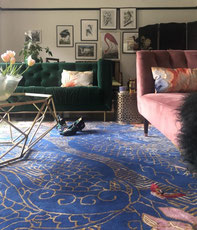
For an opulent style statement, an oversized rug will instantly transform your interior - and it's much easier than re-decorating or changing all your furniture! With 'eclectic' being a buzzword in interiors circles at the moment, it's easy to mix and match colours and themes to create a truly individual look.
This Dragon Florals rug by designer Wendy Morrison features a striking blue background with rich details in gold and pink and brings together a curated collection of furniture and accessories.